We live in a world where typography is everywhere around us. Be it appealing book covers, websites, or even ads, every single design element is carefully crafted to leave an impact on the viewers. As such, it is essential for graphic designers and marketers alike to understand the art of typography. Choosing the right font is crucial to create a stunning visual impact and evoke the right emotions. Learning the nuances of font selection and pairing can help you unleash your creativity and make your creative projects stand apart from the rest.
Choosing the Right Font: The first and foremost aspect of typography is choosing the right font. There are thousands of fonts available from serif to sans-serif, and each has a unique personality and effect. Serif fonts are generally used for print designs, while sans-serif fonts are more suited for digital designs. Serif fonts communicate a traditional, professional, and elegant look, while sans-serif gives a modern and contemporary feel. It is crucial to understand the message of your design and pick a font that communicates your message effectively.
Choosing Font Pairings: Font pairing is the art of combining two or more fonts to work well together. When done correctly, font pairings can evoke a sense of harmony and balance to your designs, enhancing their visual impact. Pairing fonts from the same family can be dull, and contrasting fonts can be jarring to the audience. It is ideal to choose one font for the headlines and another for the body copy. An effective way to combine fonts is to consider fonts that have different styles, such as bold and thin, or fonts that have a similar x-height.
Understanding Font Hierarchy: Font hierarchy is the practice of arranging fonts in a design based on their level of importance. The main aim of font hierarchy is to guide the readers' eyes through the design and deliver the intended message effectively. Establishing a hierarchy allows you to create a clear distinction between the different design elements and generate an engaging layout. The most important message should be the most prominent, with the rest of the messages arranged in descending order of importance.
Using Font Creatively: Experimenting with fonts can help you bring out your creativity and make your designs unique. Using typography creatively involves playing with font size, weight, and style to create a dynamic design. You can create focal points in your designs by using contrasting fonts in size or weight, add emphasis by using italics, or make a statement by using large, bold fonts. Using typography creatively can make your designs pop and stand out from others.
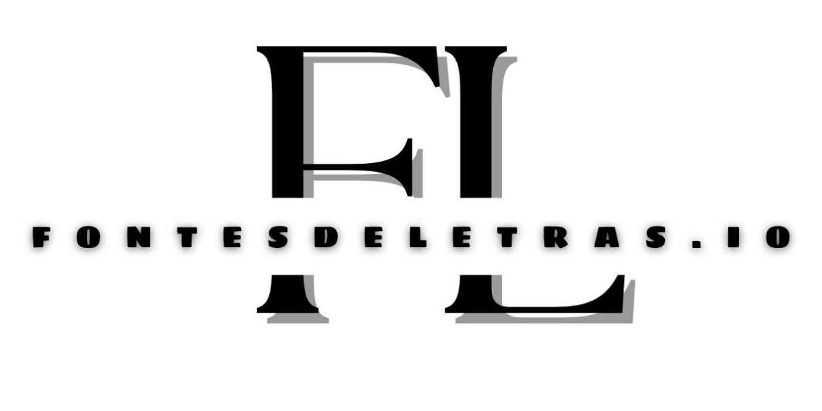
Simplify and Refine: With the plethora of options available, it is easy to get carried away with typography. However, using too many fonts can be distracting and can take away from the message you want to convey. Simplicity is key when it comes to typography. Narrow the font choices to a few and maintain consistency throughout the design. Refine the placement, scale and hierarchy to ensure that the design is easy to read and visually appealing. Are you looking for a font style, use it for free at https://fontesdeletras.io/nl/
Typography is an essential aspect of any design project, be it print or digital. Learning the nuances of font selection and pairing can open up a new world of creativity, and bring your designs to life. The right font can evoke emotions, create impact and establish brand identity. Therefore it is imperative to make sure that the typography used is a perfect fit for the message being conveyed. Remember, typography is like the clothes you wear. The more conscious and deliberate you are in choosing, the more elegant and impactful your designs will be. With practice, you'll get better at understanding typography, and even better at making it all work together in harmony.